
Definition:
‘Including people from many different countries’
Cosmopolitan is in capital letters making it bold and eye catching to customers, even though the masthead is simple, it is easily recognisable and attention grabbing to the audience. Usually their masthead stretches across the page and sits behind the main image. This is effective as they have many regular audiences whom will recognise their magazine just by seeing a couple of the letters.
Definition:
‘The prevailing fashion or style at a particular time’
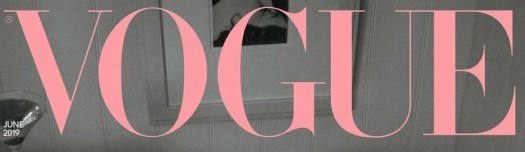
The title of the magazine presented in the form of a logo. Many magazines use a specially designed typeface for the masthead. This is useful for branding and can also help to set aside the magazine from its competitors. For Vogue their serif font reflects the genre of the magazine and also its target audience of sophisticated females interested in fashion. Additionally, the pink font stands out compared to the rest of the background which is the greyscale colours and also reflects on the target audience of the magazine, females.
Definition:
‘She’ or ‘Her’ in French
Elle is also in a serif font which again represents the feminine aspect of the magazine, reminding us that their primary target audience is females and is normally placed in the colour black which comes across as simple and sleek, targeting ABC1 females on the social grades. Elle is usually classed as a name for a female which in a sense gives the brand an identity.
