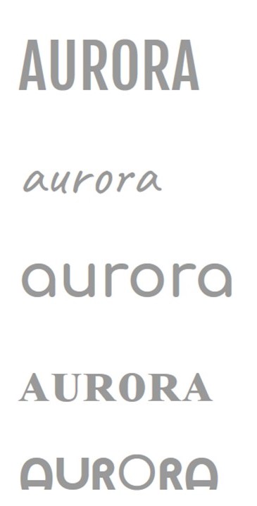
Definition:
‘A natural electrical phenomenon’
The reason that the name ‘Aurora’ came to my mind was because the definition mentions a natural electrical phenomenon which links in perfectly with the style of fashion that I am going to be promoting, casual and natural styles.
The different font ideas have been placed on the left, as you can see the fonts that I have chosen are simple and clean in order to connect with the high street fashion style.
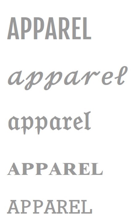
Definition:
‘clothing’
‘Apparel’ comes across as an amazing name for a magazine masthead as the definition is clothing which links in perfectly with the genre of my magazine.
I have chosen potential fonts for my magazine masthead which have been placed on the left. For ‘Apparel’ I visioned more complex fonts as it contrasts with the fashion style.
Overall, I have visioned what I want my masthead to look like, including the colour of it:
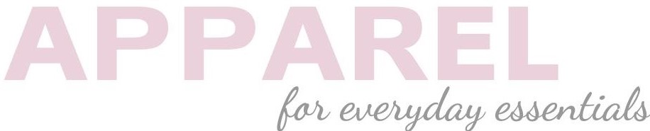
By putting my masthead in the colour pink, it embodies the feminine aspect of the magazine and clarifies the genre of the magazine to the audience; female fashion.
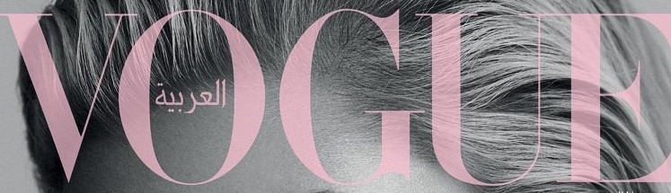
While looking into what I wanted my masthead to look like, I came across this masthead from Vogue which really inspired me to make my masthead look like this. I want my masthead to be in a baby pink colour and for the opacity to be low in order for it to be translucent.
