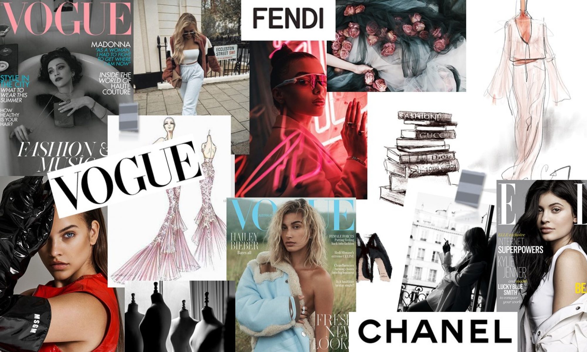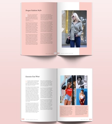
This particular article caught my eye due to the pop of colours included as it links in with my particular colour scheme. I believe that the pink on the double page spreads bring out the feminine side of the article.
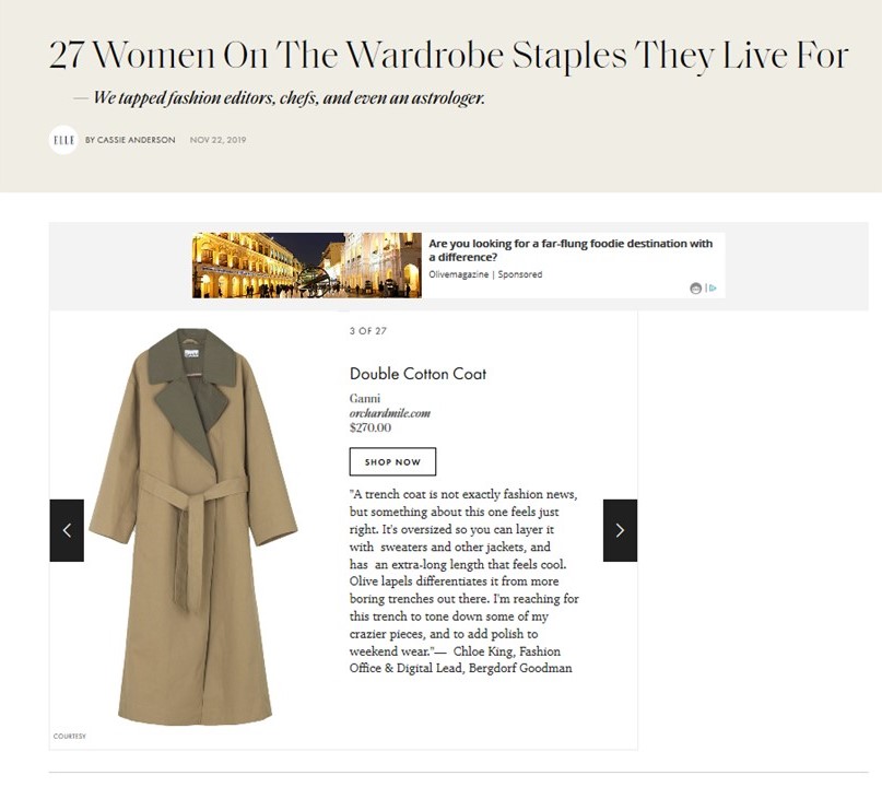
This fits in with my idea of my article as I will be including ‘ten wardrobe essentials you can’t live without during the winter’ and this article is very similar to mine, where it mentions 27 women on the wardrobe staples they live for. The article also had minimal writing which is a positive as it gets straight to the point and informs us on the information.
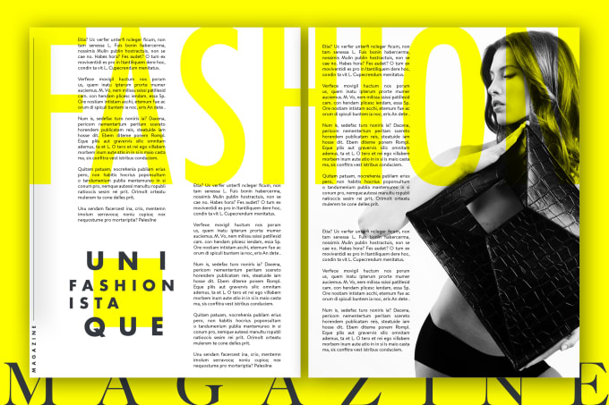
This particular article caught my eye and was one of the feature articles that I liked because of the design of it. This is because it caught my attention and intrigued me to want to read the article which is exactly what I wanted to do with my own.
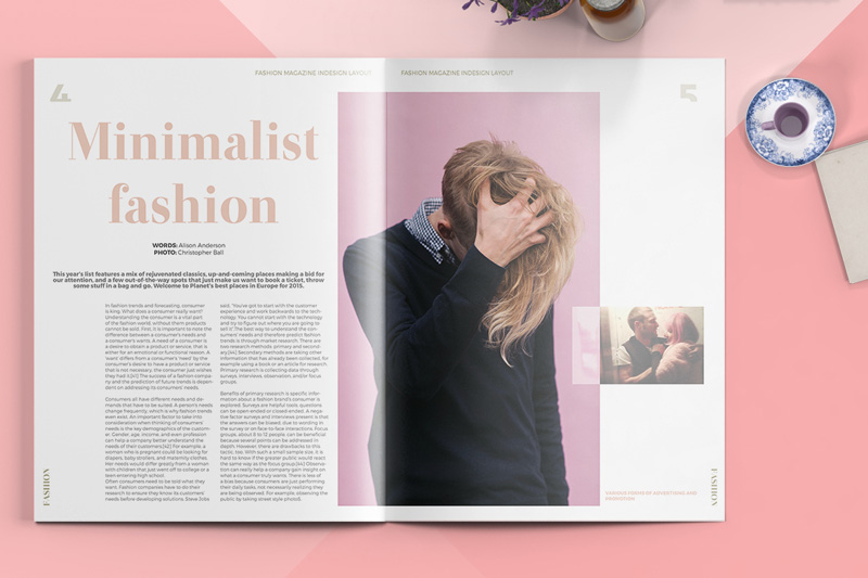
This double page spread contains an article on the left with an image on the right which I believe is effective when it comes to grabbing the audience’s attention as it allows them to also have a vision in the form of an image as well as text. After reading the article I gathered that Alison is giving her tips on minimalist fashion which I liked as it came from a first person perspective and connects with the audience more.
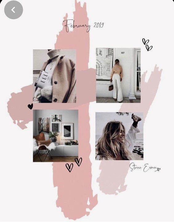
This idea for my double page spread really caught my eye as I believe having a page with just images could attract the audience more.
