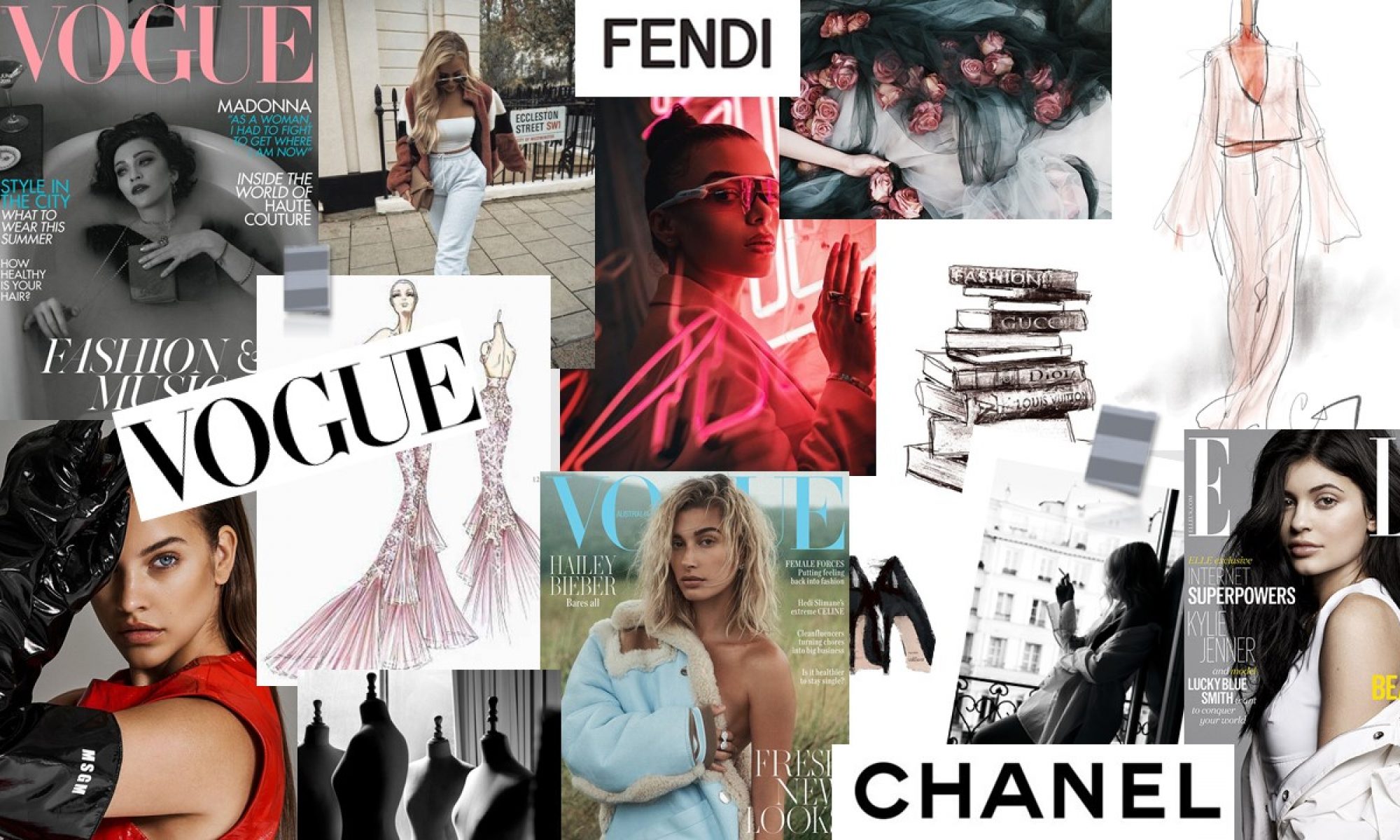
For week 2, I began to look at putting my own ideas down for my magazine. I first started with creating a mood board, to allow me to have a clearer vision of the idea I was going for.
While completing my mood-board, I thought it would be necessary for me to complete my initial proposal as I believed that this would further help me to come up with a clearer idea of my magazine, including my targeting audience and the genre I was going for. After completing my initial proposal, I conducted a focus group in order to get some feedback which then allowed me to improve my proposal.
Going back to my idea section, I then went on to creating potential mastheads for my magazine. This is where I came across a problem as I had come up with a name for my magazine, however, soon after looking more into this I came up with another name and by this point I wasn’t too sure which one to go with. Therefore, I decided to ask some people around me about which masthead name they liked more and after receiving this feedback I had come up with a final name for my magazine, ‘Apparel’. Next, I had a look at the potential fonts and colours I would use. This part didn’t take too long because from the very start I had a clear idea of what font and colour I wanted my masthead to be.
After, I went to analyse the colour palette I will be using for my magazine. The three main colours I chose were pink, grey and white as I believed these colours best suited a fashion magazine which was targeting females.
