Beginning week 6 I wanted to start my second double page spread. After adding the page numbers to my first and second double page spread I added the text boxes where I would include my article at a later stage. I then added the images I needed for that double page spread and sorted them to the positions that best suited it. For my second double page spread I had planned to add the word ‘Fashion’ running across the page at the top with the opacity low, so you could see the article text under it, which is what I did next. The reason to why I wanted that going across my page was allow the audience to understand that it is a fashion magazine and what it has to offer.
After finishing my second article I put my articles together and received feedback on my first draft. I then added to my articles and this produced my second draft. Finally, I asked one more person to give me feedback on my articles and this is when I produced my third and final article draft which was the one that I would use on my final product.
While producing my second double page spread, I had the ideas written down about what I wanted it to look like, however, after producing it, I found that there was something missing and started to make a few changes. I then made a new double page spread which looked like this:
However, I still found that there was something missing and I wasn’t fully happy with my second double page spread, which is when I decided to make some more changes to it and by the end of week 6, my second double page spread looked like this:
While looking at my first double page spread I felt like in order for me to achieve the highest grade I need to make a double page spread which fits in the correct codes and conventions of a fashion magazine. Therefore, I decided to change my first double page spread. Also I swapped around the order of my double page spread, my second one suited best if it came first and I put my first double page spread as second. So my second double page spread now looks like this:
While on task 2 on my assignment brief, I needed to continue with my production diary but now outlining what i am doing, why i am doing it and how I have done it.
The next thing I have completed from my brief is I have created one front cover and double page spreads using Photoshop and InDesign. I then showed them to two people and asked them for constructive feedback.
The feedback I received from the first person I asked was that for my front cover the direct eye contact catches the audience’s attention and the transparent masthead allows the audience to have more of a focus on the image as it is a fashion magazine. Furthermore, the sell line ‘The woman in you’ connects with the audience as it is addressing the audience directly. However, for something to add to my front cover, she mentioned that I needed to add more a couple more sell lines to fill up some of the gaps. After doing so my front cover now looks like this:

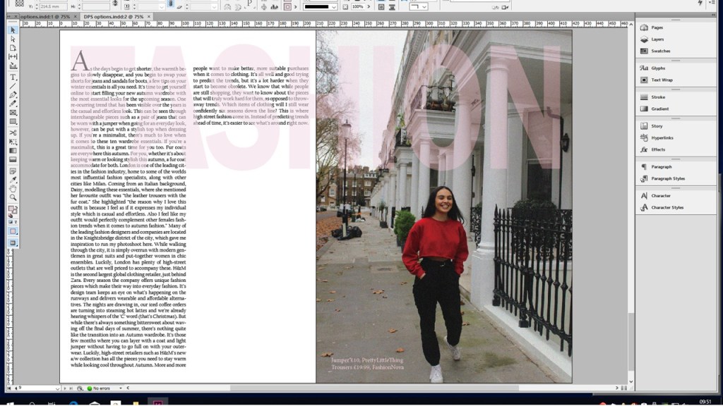
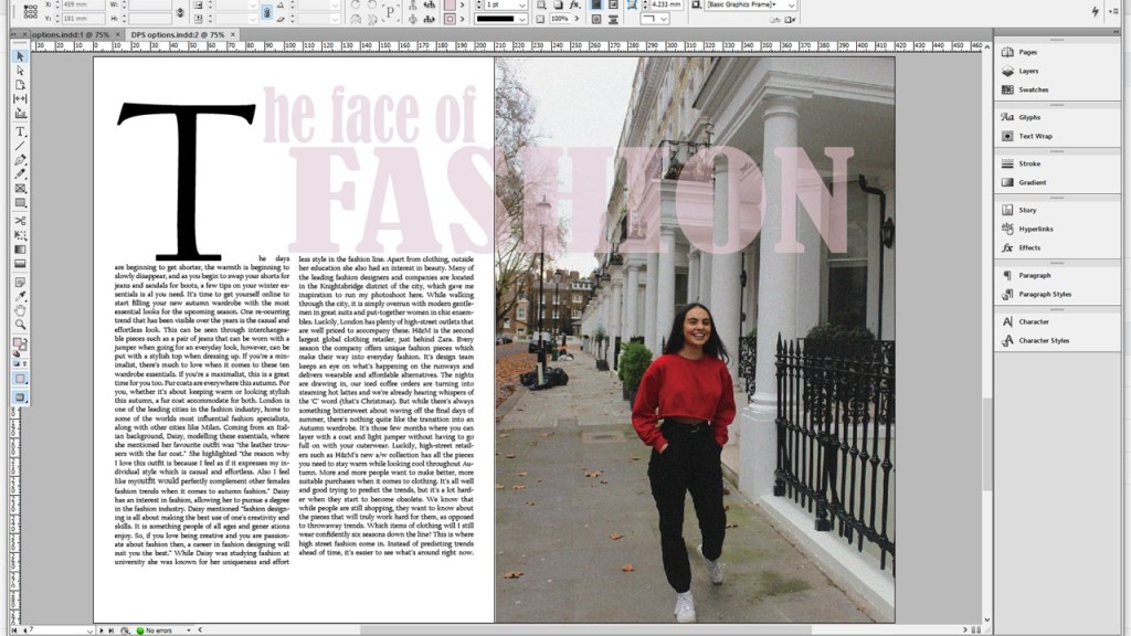
For my first double page spread she mentioned that the heading ‘The face of fashion’ draws the reader’s attention to the article and makes them look at the models face as the heading refers to the face. Also the page numbers that I have included on my double page spread is a key convention of a magazine. Furthermore, the listing of the clothing allows the audience to receive inspiration from the images.
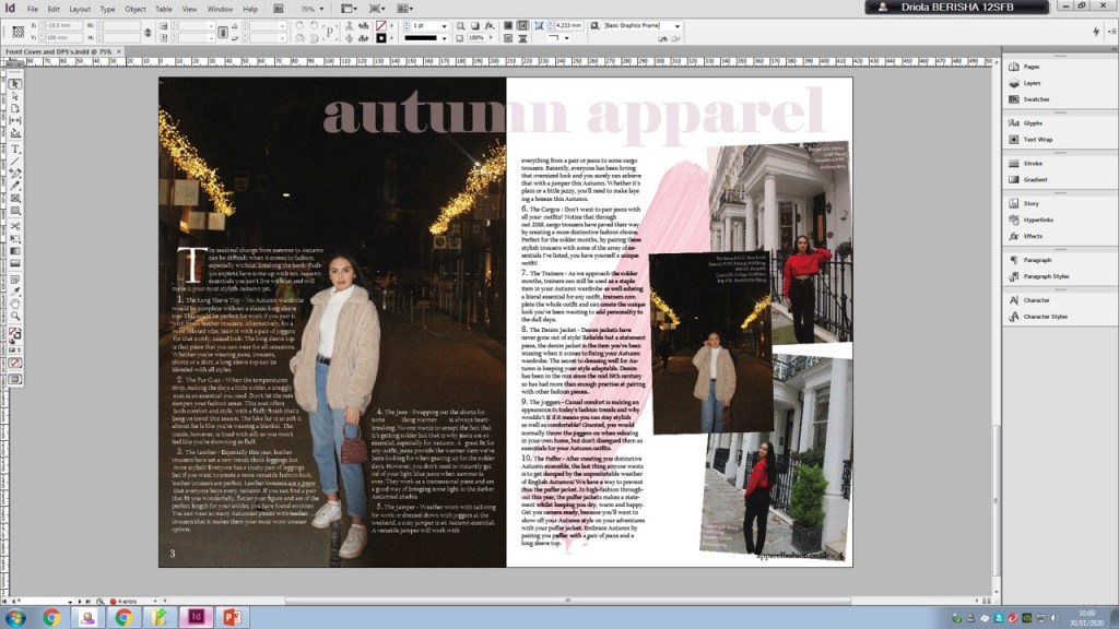
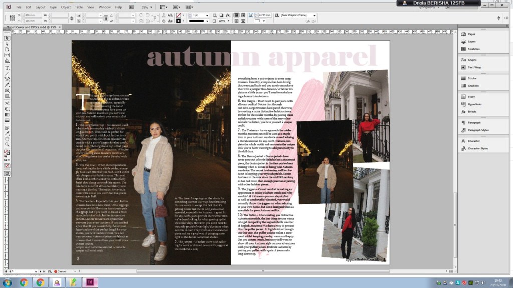
For my second double page spread she mentioned that the collage of images on the right hand side gives the audience a variety which is interesting to see and the text on the left, over the image, has been laid out so that the audience are still able to see the full image. Additionally, the brush stroke is creative and compliments the colour of the heading. One thing that she mentioned to improve on for my second double page spread was to add the outfit listing on the images just like I did for my first double page spread. After doing so my second double page spread looks like this: