Week 7

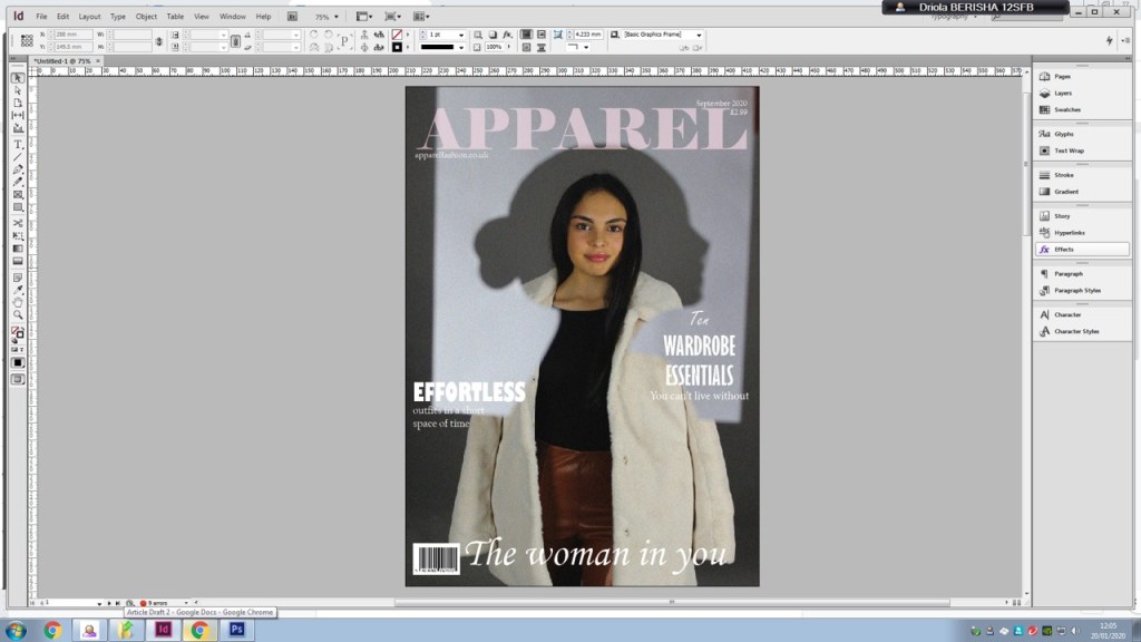
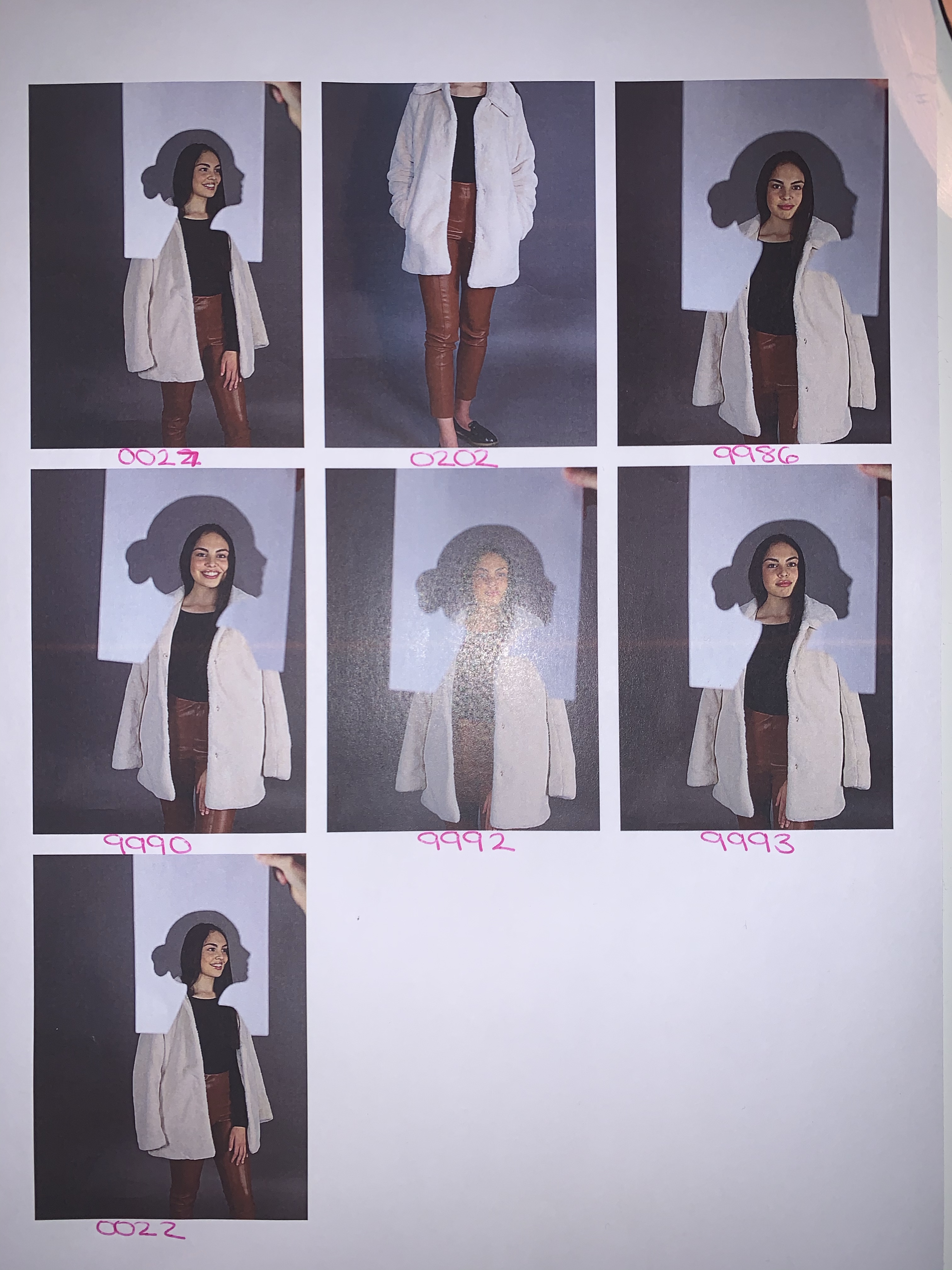
At the start of week 7, I still needed to ask one more person for feedback on my front cover and double page spreads. The second person I asked mentioned that my front cover was that there was a good amount of sell lines as it doesn’t divert the audience from the main image, however, she mentioned that I could add one or two more sell lines just to see if it makes the front cover look better. Also she liked that the masthead is stretched across the page which makes it stand out more.

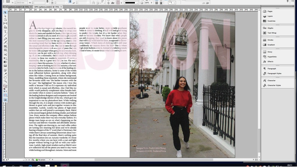
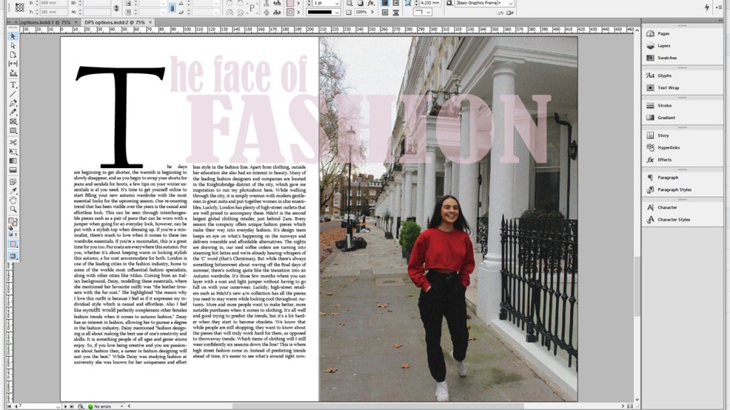
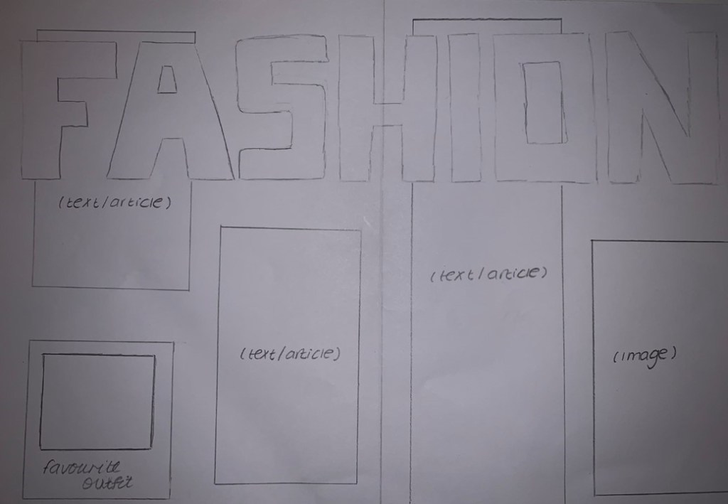
She then mentioned that on my first double page spread the heading is spread out across the two pages which is aesthetically pleasing. Also the drop cap is a convention of a magazine. The heading is spread out across the two pages which is aesthetically pleasing. The drop cap is a convention of a magazine.

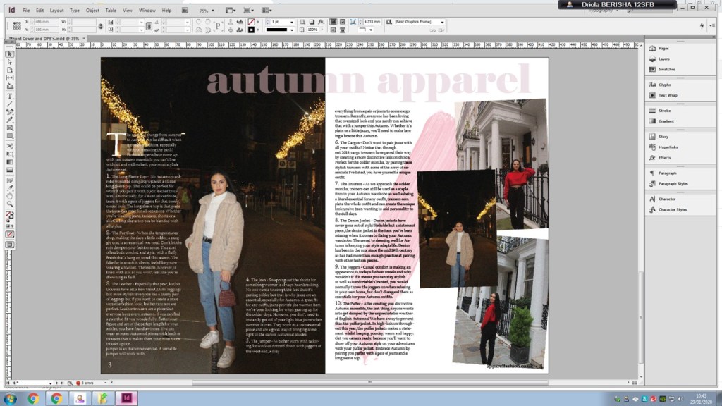
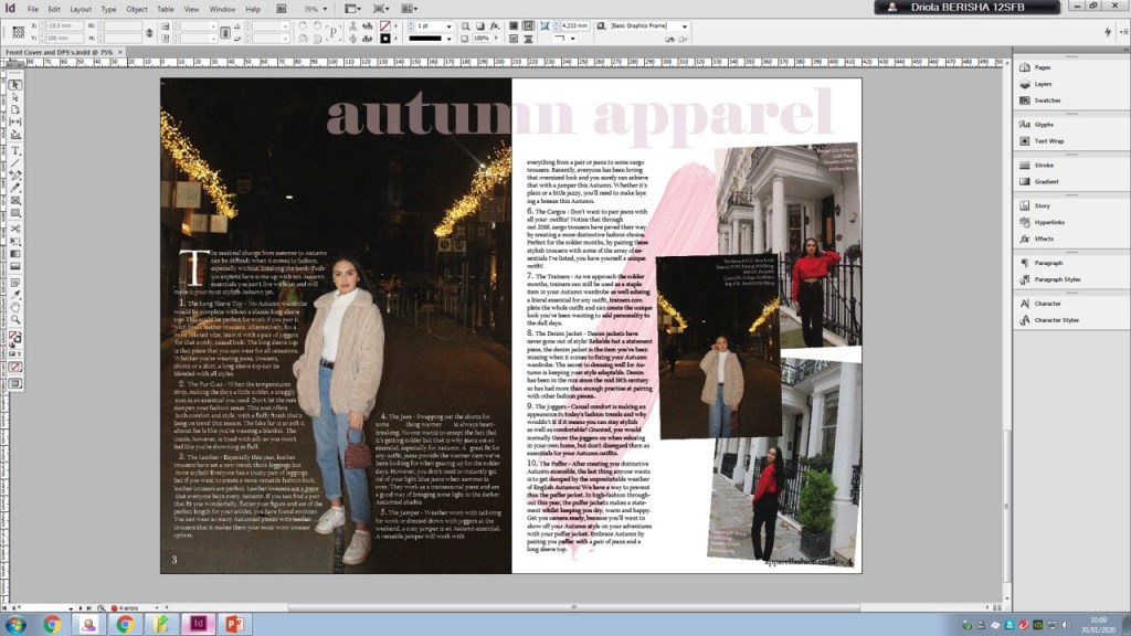
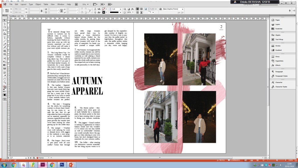
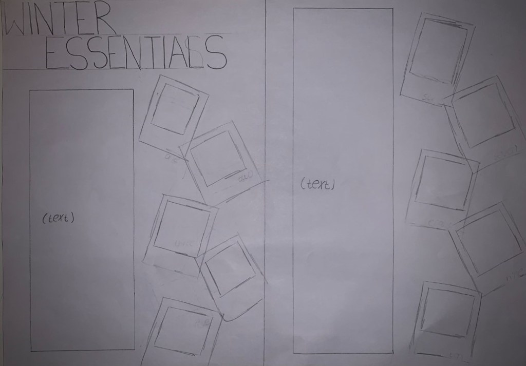
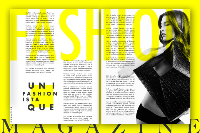
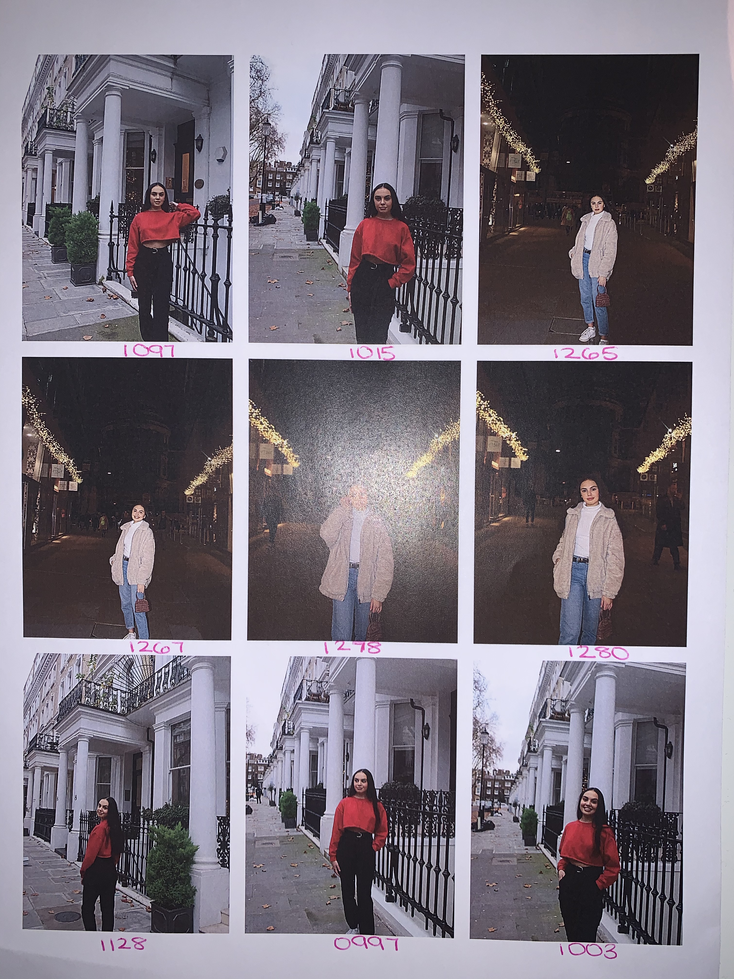
Finally, she mentioned that on my second double page spread, the collage of pictures looks good on the page and the two outfits fit in well together. Furthermore, the wrap text on the left hand page looks good as it wraps around her body which looks unique. The collage of pictures looks good on the page and the two outfits fit in well together. The wrap text on the left hand page looks good as it wraps around her body which looks unique.

After receiving feedback from two people before I produced my final magazine, for week 7 I decided to start my evaluation which is the last part for task 2 on my brief. For my evaluation I need to explain the aesthetic, technical and production decisions taken and evaluation how the resulting product successfully appeals to the target audience. I also need to review my project management by evaluating the success of the different activities undertaken and discuss specific examples of how effective they were in having an impact upon the planning and pre-production of the digital media production. Consider the project management of logistics (such as personnel, resources and time), finance , creative processes, and factors such as how well you maintained the documentation, minimised risks and complied with regulatory issues. Finally, I need to consider how I managed any problems or difficulties that occurred during the project and draw conclusions to identify ways in which the project management processes you used may be improved upon in future productions.

By the end of week 7, I had finished my evaluation and I received feedback from it, to allow me to make improvements so I could produce an evaluation to the best of my ability. I then added my final product onto my website and handed everything in for my assignment.

Week 6

Beginning week 6 I wanted to start my second double page spread. After adding the page numbers to my first and second double page spread I added the text boxes where I would include my article at a later stage. I then added the images I needed for that double page spread and sorted them to the positions that best suited it. For my second double page spread I had planned to add the word ‘Fashion’ running across the page at the top with the opacity low, so you could see the article text under it, which is what I did next. The reason to why I wanted that going across my page was allow the audience to understand that it is a fashion magazine and what it has to offer.

After finishing my second article I put my articles together and received feedback on my first draft. I then added to my articles and this produced my second draft. Finally, I asked one more person to give me feedback on my articles and this is when I produced my third and final article draft which was the one that I would use on my final product.

While producing my second double page spread, I had the ideas written down about what I wanted it to look like, however, after producing it, I found that there was something missing and started to make a few changes. I then made a new double page spread which looked like this:

However, I still found that there was something missing and I wasn’t fully happy with my second double page spread, which is when I decided to make some more changes to it and by the end of week 6, my second double page spread looked like this:

While looking at my first double page spread I felt like in order for me to achieve the highest grade I need to make a double page spread which fits in the correct codes and conventions of a fashion magazine. Therefore, I decided to change my first double page spread. Also I swapped around the order of my double page spread, my second one suited best if it came first and I put my first double page spread as second. So my second double page spread now looks like this:

While on task 2 on my assignment brief, I needed to continue with my production diary but now outlining what i am doing, why i am doing it and how I have done it.

The next thing I have completed from my brief is I have created one front cover and double page spreads using Photoshop and InDesign. I then showed them to two people and asked them for constructive feedback.

The feedback I received from the first person I asked was that for my front cover the direct eye contact catches the audience’s attention and the transparent masthead allows the audience to have more of a focus on the image as it is a fashion magazine. Furthermore, the sell line ‘The woman in you’ connects with the audience as it is addressing the audience directly. However, for something to add to my front cover, she mentioned that I needed to add more a couple more sell lines to fill up some of the gaps. After doing so my front cover now looks like this:

For my first double page spread she mentioned that the heading ‘The face of fashion’ draws the reader’s attention to the article and makes them look at the models face as the heading refers to the face. Also the page numbers that I have included on my double page spread is a key convention of a magazine. Furthermore, the listing of the clothing allows the audience to receive inspiration from the images.

For my second double page spread she mentioned that the collage of images on the right hand side gives the audience a variety which is interesting to see and the text on the left, over the image, has been laid out so that the audience are still able to see the full image. Additionally, the brush stroke is creative and compliments the colour of the heading. One thing that she mentioned to improve on for my second double page spread was to add the outfit listing on the images just like I did for my first double page spread. After doing so my second double page spread looks like this:

Week 5

For week 5, I began by starting on In Design, which is the application that I will be using to produce my magazine front cover and double page spreads. I set up the pages to the dimensions I needed for my front cover and double page spreads.

I have attached my pages for my front cover and my double page spread.

I then played around with the masthead and chose a font for my masthead, changed the colour of it to a light pink and then lowered the opacity of my text to make it more transparent.

Next, I added the month, the price of the magazine and a barcode for my magazine. After this, I added my sell lines to my front cover.

I then moved onto my first double page spread, leaving my front cover half done. I decided to add the pictures on my first double page spread and fix the brush strokes that I was planning to do on the right page. On the left, I added the text from my article that I had written and sorted out all of the font and sizing.

My front cover looked like this:

My first double page spread looked like this:

At the end of week 5 I wanted to start my second double page spread. After adding the page numbers to my first and second double page spread I added the text boxes where I would include my article at a later stage. I then added the images I needed for that double page spread and sorted them to the positions that best suited it. For my second double page spread I had planned to add the word ‘Fashion’ running across the page at the top with the opacity low, so you could see the article text under it, which is what I did next. The reason to why I wanted that going across my page was allow the audience to understand that it is a fashion magazine and what it has to offer.

Week 4

At the start of week 4, I had a look at the marketing side of my magazine. I first thought of promotional methods that I would use in order to allow me to promote my magazine. Doing so, I figured out that I would be using social media as I believe it is a big part in our society now. I then had a look at the New Media.

Before conducting my photo-shoots I had an idea about what I wanted my magazine front cover and double page spreads to turn out. However, after receiving all my images and having a look at them I then sketched out a couple front covers and double page spreads. These allowed me to see my different options drawn out and make it easier for me to chose my final products.

After completing my sketches I now needed to transform those drawing into something that looked more like a magazine. I created a few magazine drafts for my front cover and double page spreads. After doing so, I got some feedback to how I could improve them or what was good about them. This feedback enabled me make an easier decision at later stages when it came to me actually producing my final products. The feedback is listed on the blog.

By the end of week 4, I have completed task 1 when it comes to my assignment brief. I completed my pre-production requirements relevant to the specific sector that your media product belongs to. I also completed: sourcing personnel and resources, preparing budgets, costs and schedules, health and safety documentation, legal/ethical considerations and risk assessing the project.

Next I included annotated examples of my work clearly demonstrating my choices, why i have chosen them and how they relate to my audience, genre and platform. This has been shown through my production diary outlining all my considerations, choices and the selection process.

For the end of week 4, I decided to finish all the small tasks before I begin creating my final product. For example, I finished my draft feedback which allowed me to have a clearer idea about what I wanted my final product to look like.

Week 3

At the start of week 3 I decided to try and complete my ideas, so by the end of the week I could conduct my photo-shoots. The first thing I decided to do for this week was have a look at what sell lines I would use on my magazine front cover. This allowed it to become much easier for me when it came to actually making my magazine and I could just insert them on my front cover.

Then, I got a couple of images to create more of a vision to how I wanted my model to pose before our photo-shoots.

After having an idea of what I wanted my images to look like, I went on to have a look at potential outfits I could put my model in. Due to this being a fashion magazine, this could be seen as one of the most important parts as the main focus is on the clothing that my model has been put in.

I was about to begin my photo-shoot, I first completed my studio shoot and a few days later I completed my location shoot.

Then, I went through all my images from my studio shoot and location shoot, I first printed out my contact sheets for my studio shoot and location shoot.

I then needed to narrow down my images, after doing so I printed out my chosen images that I would potentially use on my front cover and double page spreads. Doing this allowed me to have a clearer idea of what images I would use.

Week 2

For week 2, I began to look at putting my own ideas down for my magazine. I first started with creating a mood board, to allow me to have a clearer vision of the idea I was going for.

While completing my mood-board, I thought it would be necessary for me to complete my initial proposal as I believed that this would further help me to come up with a clearer idea of my magazine, including my targeting audience and the genre I was going for. After completing my initial proposal, I conducted a focus group in order to get some feedback which then allowed me to improve my proposal.

Going back to my idea section, I then went on to creating potential mastheads for my magazine. This is where I came across a problem as I had come up with a name for my magazine, however, soon after looking more into this I came up with another name and by this point I wasn’t too sure which one to go with. Therefore, I decided to ask some people around me about which masthead name they liked more and after receiving this feedback I had come up with a final name for my magazine, ‘Apparel’. Next, I had a look at the potential fonts and colours I would use. This part didn’t take too long because from the very start I had a clear idea of what font and colour I wanted my masthead to be.

After, I went to analyse the colour palette I will be using for my magazine. The three main colours I chose were pink, grey and white as I believed these colours best suited a fashion magazine which was targeting females.

Week 1

During week 1, I decided to have a look at the research section when it comes to producing a magazine. This includes the masthead analysis, equipment list and feature article analysis.

First, I completed the masthead analysis. This allows me to have a look at current magazine brands and analyse the positives and negatives of other mastheads, in order for me to later on, produce a masthead of my own for my magazine.

After that, I made a blog about the equipment I will use in order for me to have everything listed and so I clearly know that I will be using.

The last thing I completed for week 1 was the feature article analysis. This was where I had a look at existing magazine articles and began to form more of a vision about what I wanted my articles to be about. Also in this section I looked at potential double page spread layouts. On the blog I chose a potential option and explained why I liked that idea.

Listed Outfits

Below I have added the three different outfits that my model was in and I have listed the shop you can buy the pieces from and how much they each cost.

Black Basic Long Sleeve Top

PrettyLittleThing – ยฃ8

White Fur Coat

H&M – ยฃ60

Brown Leather Trousers

H&M – ยฃ14.99


Red Cropped Jumper 

PrettyLittleThing – ยฃ10

Black Cargo Trousers

FashionNova – ยฃ19.99


White Long Sleeve Turtleneck 

New Look – ยฃ12

Blue Mom Jeans 

PrettyLittleThing – ยฃ30

Black Belt

Primark – ยฃ3

Brown Teddy Bear Coat 

Urban Outfitters – ยฃ59.99

Rose Croc Mini Grab Bag

PrettyLittleThing – ยฃ15

Sketches

In order to allow me to have a clear vision of my magazine front cover and double page spreads I decided to draw a couple of sketches so I can then decide which one I may potentially use. 

Front Covers

The first draft and the second one are exactly the same, the only difference is the way that the price is laid out. On the first one the price is just under the โ€˜Aโ€™ of the masthead, however, on the second one it is in a button which is more appealing to potential customers.

After creating drafts for my front cover, I decided to change my targeted fashion from winter fashion to autumn fashion. Therefore, under the masthead where it mentions that it is a December 2019 edition, instead it will be a September 2019 edition.

Also on one of the sell lines where it mentions ‘your most stylish winter yet!’, instead it will be ‘your most stylish autumn yet!’

Double Page Spreads

The first double page spread that I drew out was my first initial idea. However, after receiving feedback from others I decided not to use it as I believed having the ten polaroids on the left hand side was a bit too much and looked over-crowded on the page.

Still liking this idea, I decided to amend this idea and split up the ten polaroid’s over the double page spread so there was more of a focus on the outfits in the polaroid’s.

However, while exploring different ideas that I could potentially use I decided not to use the polaroid idea on the double page spread but instead I have come up with two different double page spreads.

On the left is the idea that I saw online and my sketch is on the right. On my sketch in the bottom left hand corner I will include a polaroid of my models outfit which is her ‘favourite outfit’.

For my second double page spread, on the left page, it will be text heavy and will include the title in the middle of the page. On the page on the right hand side, it will be image based and on the right is the image where I got my idea from. However, after sketching out my double page spreads I decided to change my targeting fashion season from winter to autumn.

Again, after changing my targeted fashion season, on my double page spread instead of it saying ‘Winter essentials’ it will now say ‘autumn essentials’

Chosen Images

I have narrowed my images down from my contact sheets to my chosen images so I can now begin to vision my images on my front cover or on my double page spreads.

Studio Shoot

Location Shoot

Design a site like this with WordPress.com
Get started