Equipment

In this blog I will discuss what equipment I have planned to use and why it is useful when it comes to helping me produce my magazine. I have also mentioned what camera I will use and the different features that you can find on the camera, which will ensure in me creating professional and realistic photographs that I will use for my magazine front cover and double page spreads.


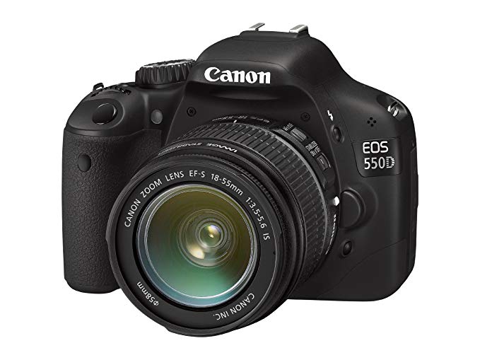
I will be using the Canon 550D camera, this will enable me to achieve professional photographs in order to make my magazine look realistic.


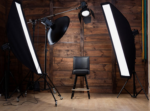
Studio lights are essential to most photographersโ€™ as it allows us to create natural lighting effects in a variety of situations. I will also be using two soft boxes to control the shape and direction of light and prevent more light-spill from occurring.ย 


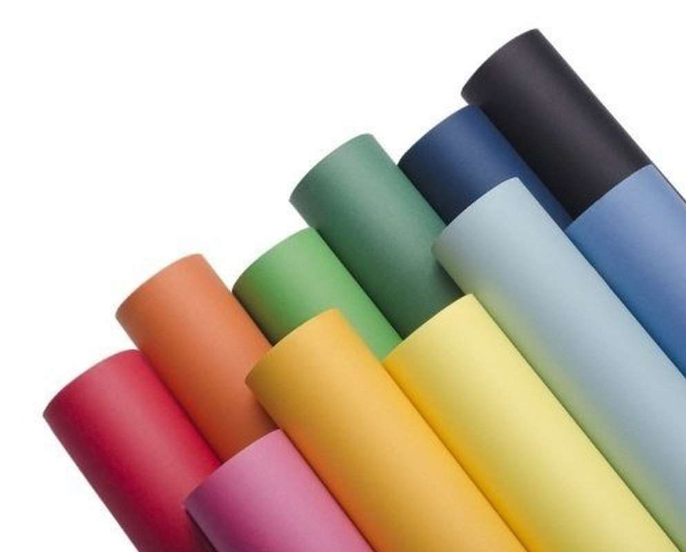
The different colour backdrops allow me to change the colour of the background of the image, allowing me to change the mood of the image portrayed.

Masthead Analysis

Definition:

โ€˜Including people from many different countriesโ€™

Cosmopolitan is in capital letters making it bold and eye catching to customers, even though the masthead is simple, it is easily recognisable and attention grabbing to the audience. Usually their masthead stretches across the page and sits behind the main image. This is effective as they have many regular audiences whom will recognise their magazine just by seeing a couple of the letters.


Definition:

โ€˜The prevailing fashion or style at a particular timeโ€™

The title of the magazine presented in the form of a logo. Many magazines use a specially designed typeface for the masthead. This is useful for branding and can also help to set aside the magazine from its competitors. For Vogue their serif font reflects the genre of the magazine and also its target audience of sophisticated females interested in fashion. Additionally, the pink font stands out compared to the rest of the background which is the greyscale colours and also reflects on the target audience of the magazine, females.


Definition:

‘She’ or ‘Her’ in French

Elle is also in a serif font which again represents the feminine aspect of the magazine, reminding us that their primary target audience is females and is normally placed in the colour black which comes across as simple and sleek, targeting ABC1 females on the social grades. Elle is usually classed as a name for a female which in a sense gives the brand an identity.

About

My name is Driola Berisha and I am seventeen years old. I study Media (as well as Business and Economics) and on the website I will be taking you through all the steps of the pre-production, production and post-production of my magazine.

Design a site like this with WordPress.com
Get started